Easy choice: a spice brand “Speс” for “Gurmina”
The company "Gurmina", one of the largest producers and suppliers of spicery in Belarus, has brought to market a new range of spices in the economy segment. It was necessary to singularize the brand in the competitor-filled niche, while maintaining connection with the product and price category.

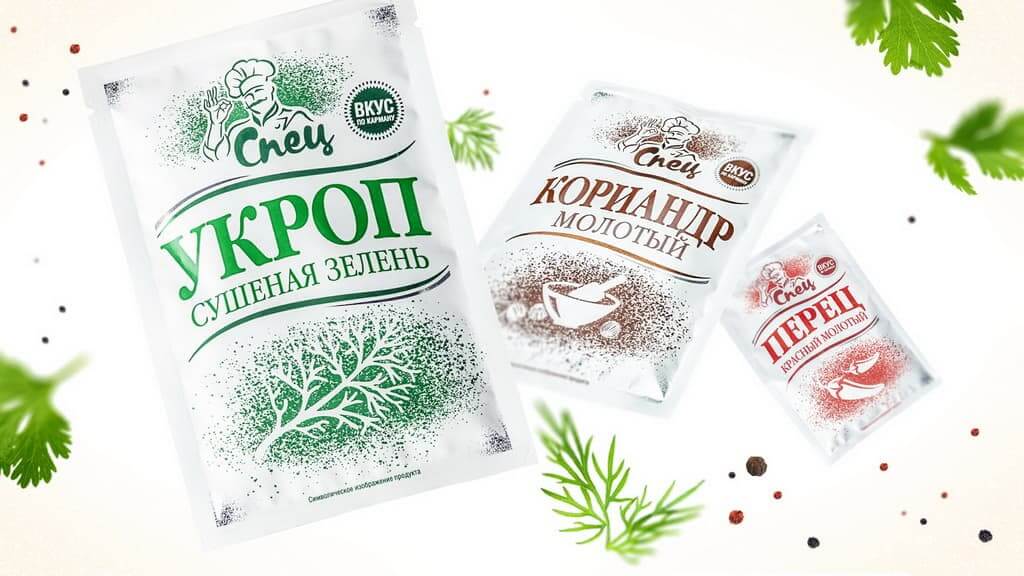
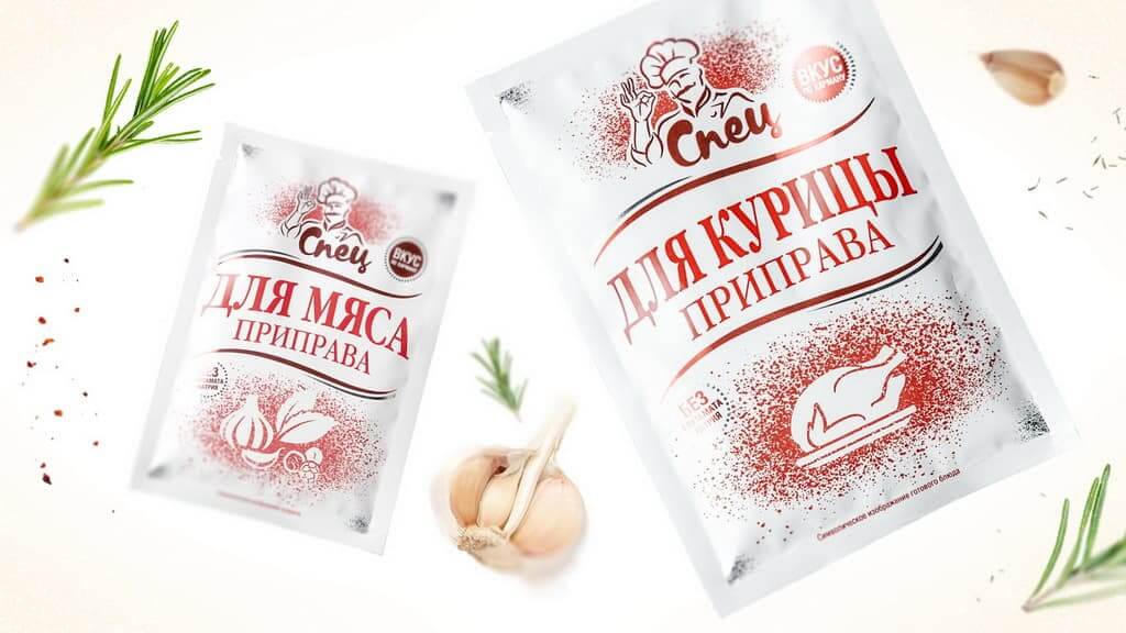
The concise and splendid name “Speс” attracts the attention with an accurate combination of the needed associations: it is both the designation of the category "spices" and the assurance of the manufacturer's expertise.

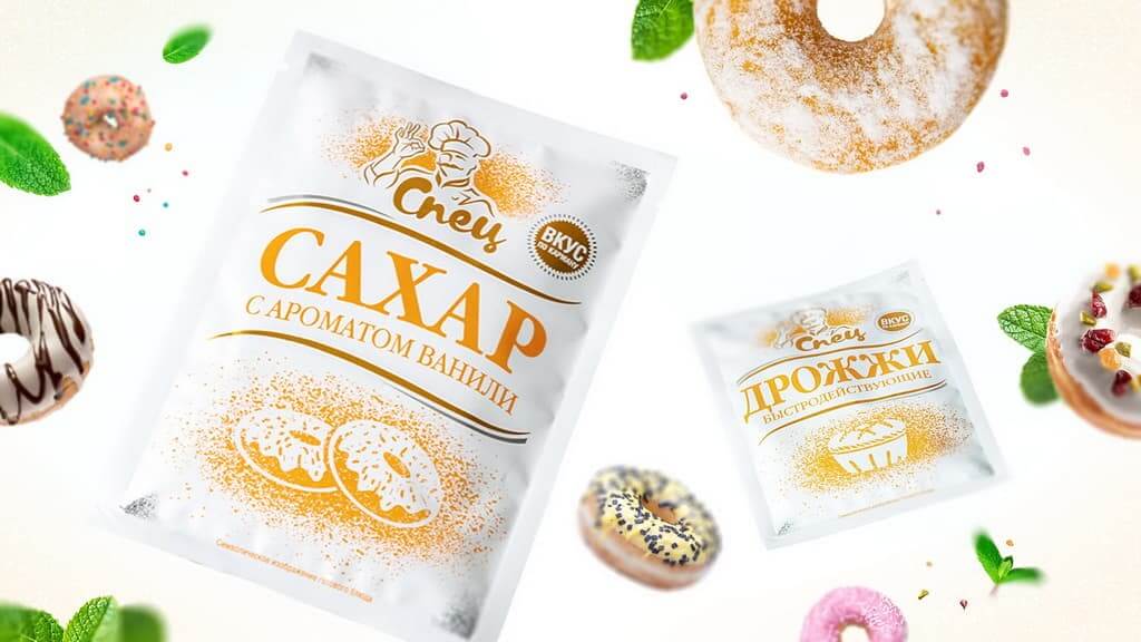
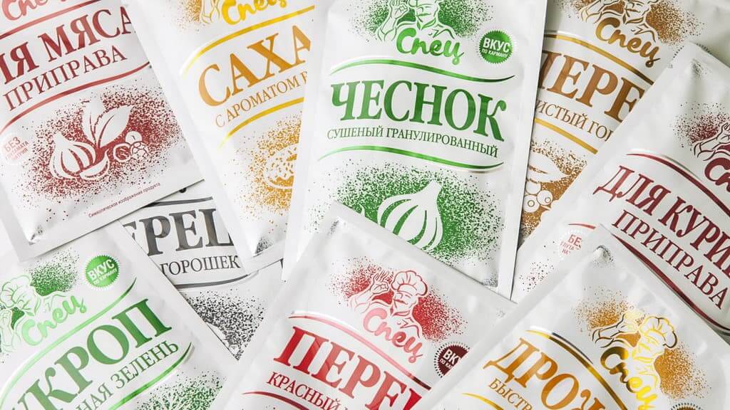
Monochrome illustrations, as if created using a stencil from spilled spices, have become a visual style-forming element. Stylized as a craft, they’re conveying the idea of an attentive and careful manufacturer who personally controls the quality of the goods. The sense of man-made is increased by the tactile effect - the contrast of matte lacquer and glossy elements.

Metallized packaging material gives relevance and style to the design of a low-priced product, as well as demonstrates in an advantageous way good barrier properties of the package that are often not characteristic for this price category.

The correct emphasis, high informative nature and thoughtful color coding make the packaging understandable and convenient for buyers. The concept easily adapts to any SKU, providing opportunities for future expansion of the line.


