Focus on cleanliness: «Tone» hygienic products packaging design
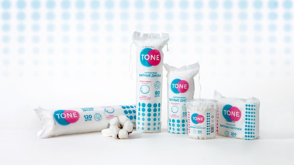
Sellwin Group has launched a new hygienic product line. Packaging task - to highlight brand amongst overcompetitive segment, to attract attention and earn trust to the new product.

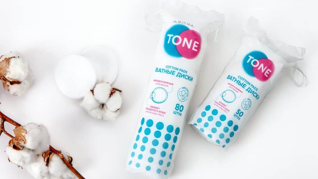
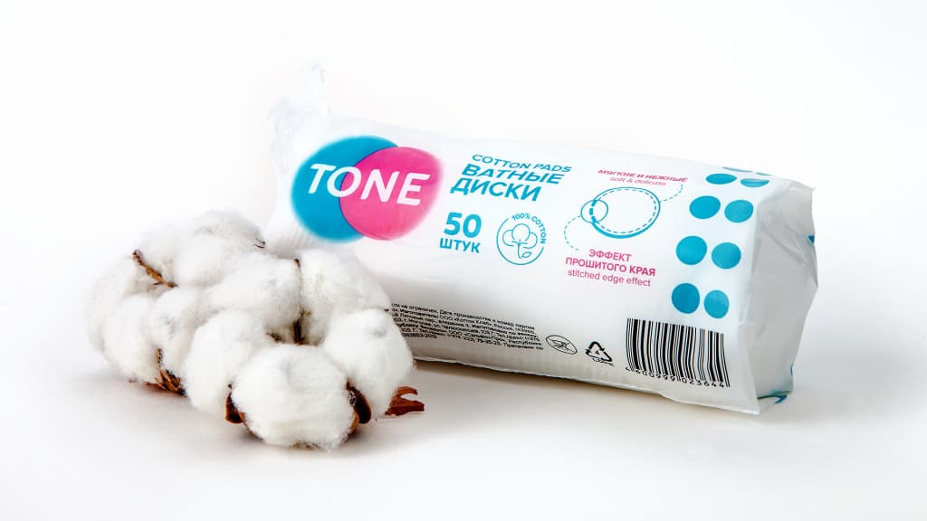
Key design elements - dynamic pattern and contrast logo. Theirs soft and rhytmic geometry, tender, but expressive colours gain attention and making packaging visible on a shelf. Large amount of white colour adds to the display of goods, describing the idea of freshness and cleanliness.

Laconic design looks neatly and stylish, illustrating brand positioning - modern and gentle care for yourself.


