Strengthening the Tvitnik brand. Packaging redesign
Tvitnik is a range of spices and seasonings produced by the Belarusian manufacturer LIDKON, created for those who value the quality of their food and their health. It consists of pure ingredients without salt, artificial colors, or flavor enhancers.The objective set before the Agency is to differentiate and strengthen the Tvitnik brand compared to its competitors.
Solution:
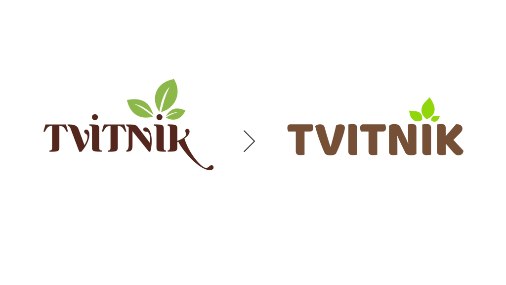
- Logo update while maintaining recognizability.
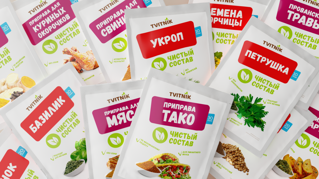
- Comprehensive redesign of all 34 products.
- Introduction of color coding for the two main lines: spices and seasonings.
- Enhancement and expansion of brand communication - key product qualities that hold the greatest value for consumers are presented in the form of short messages.
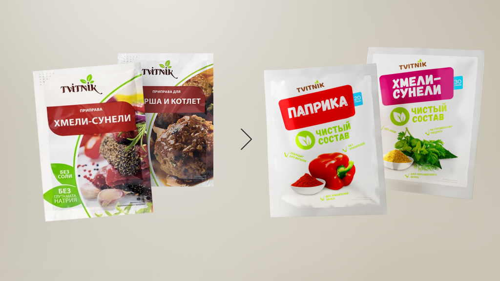
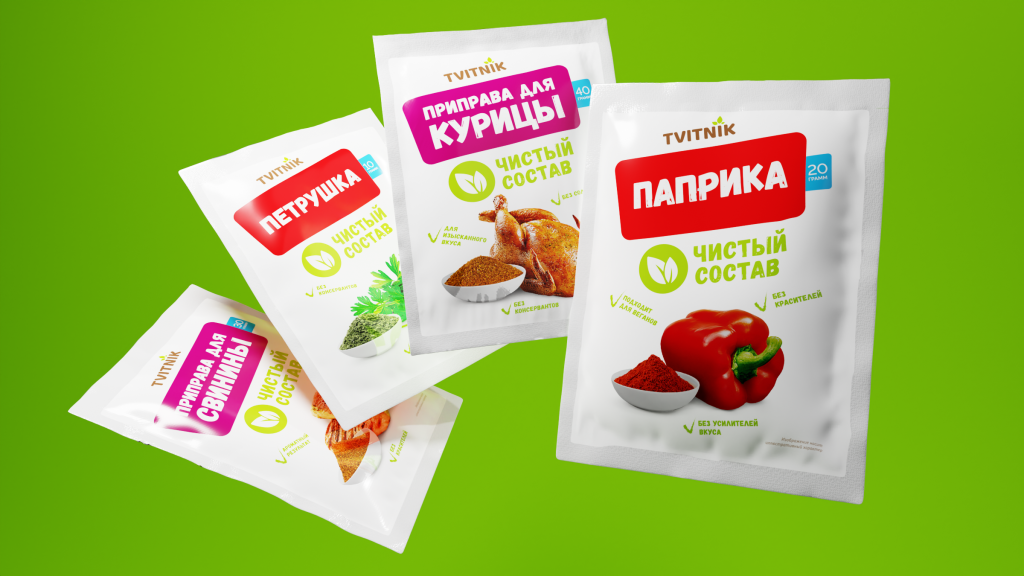
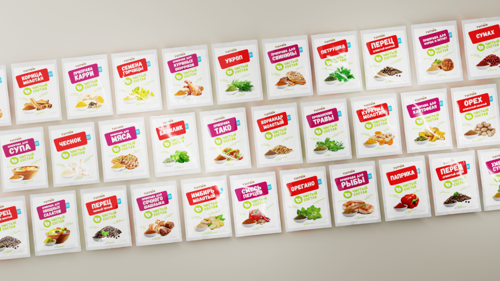
Bright food zones on the front side of the packaging create a visual effect, and a system of pictograms on the back side provides customers with additional information on the gastronomic combinations of spices with various dishes.
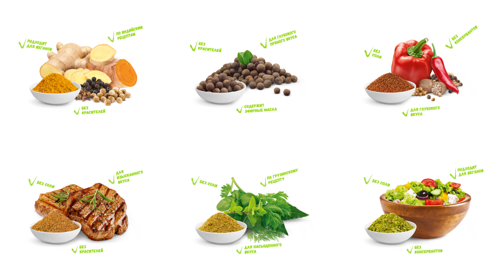
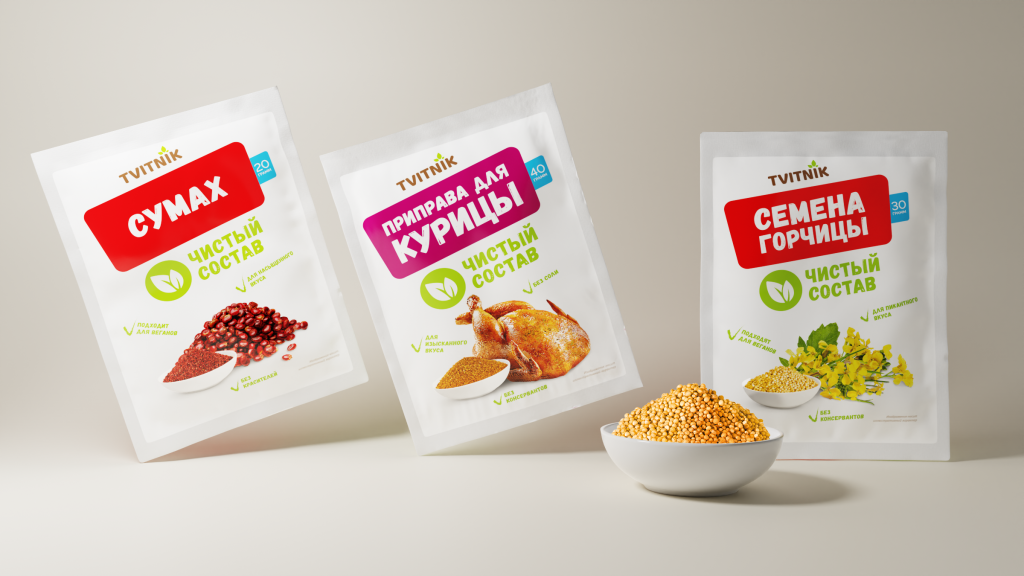
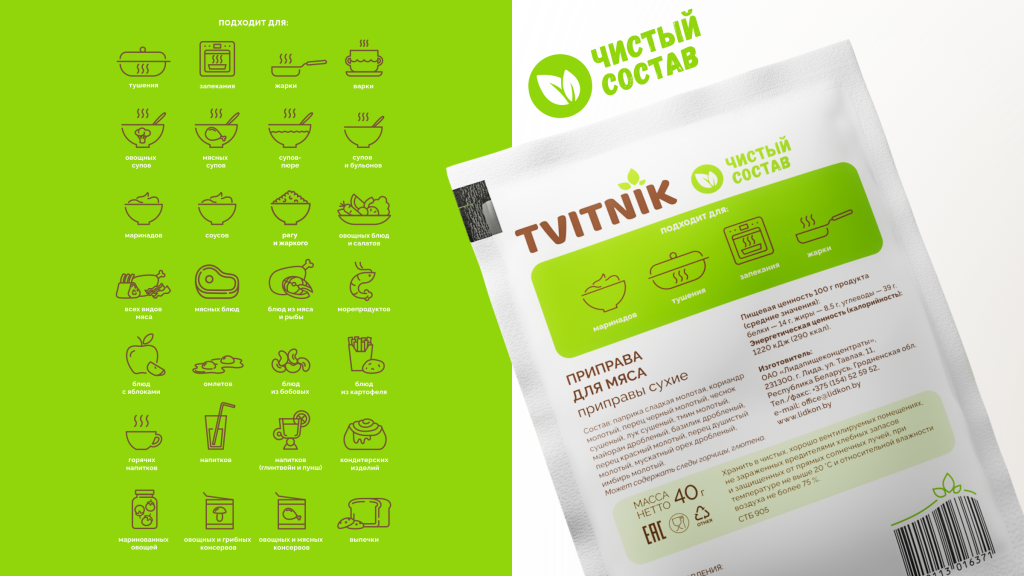
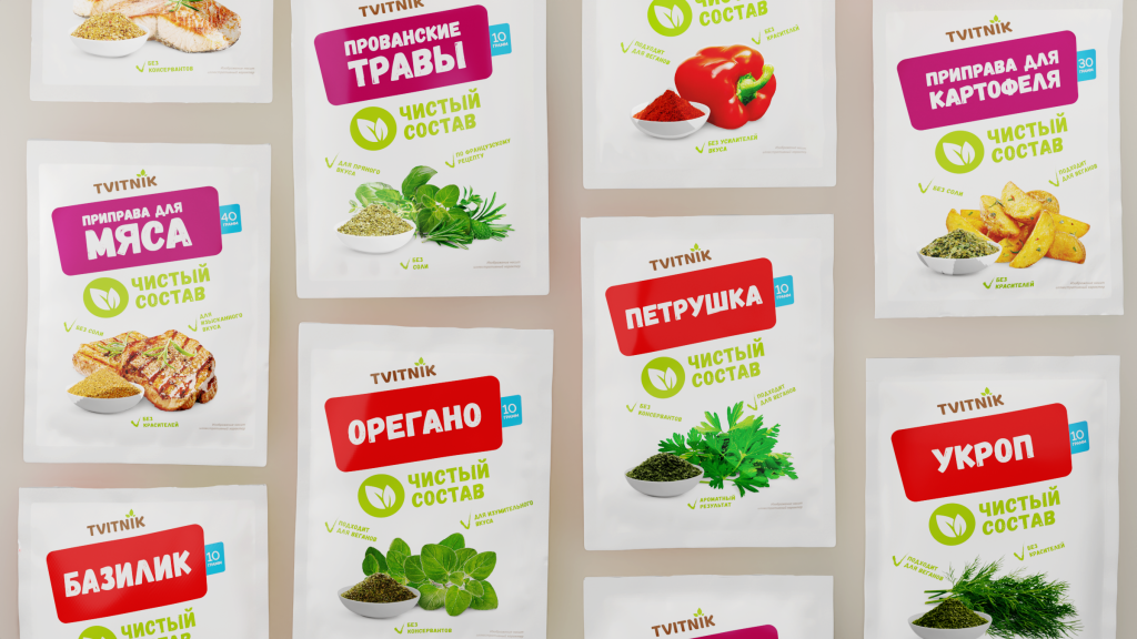
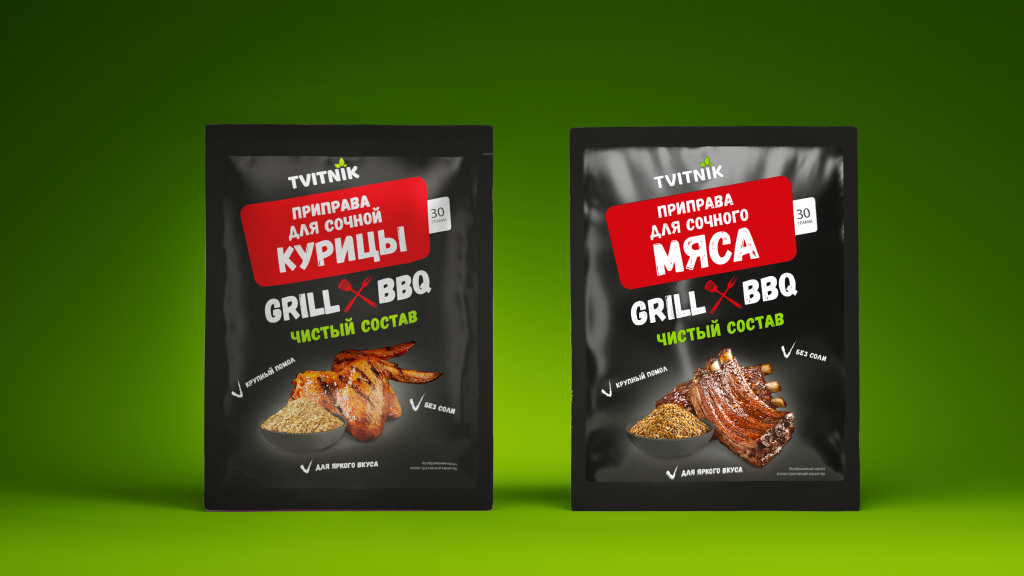
A separate redesign was developed for the "GRILL & BBQ" line, with differentiation of seasonal products from the rest of the lines.
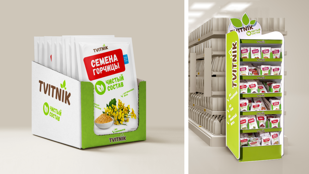
To attract more attention to the brand's range, the designs of show boxes and branded equipment have been updated.
Project team:
Ilya Pushkar — Art director
Irina Shebeko — Technical director
Alexey Litvinovich — Designer
Veronika Nesteruk — Designer
Anna Meleshkina — Designer
Alexandra Atroshkina — Designer
Anastasia Sokolovskaya — Copywriter
Olga Oleinik — Managing partner, Creative director
Natalya Elinskaya — Account director
Anna Vasiukovich — Project manager

